

From Bespoke's chart of the day, this unsettling graphic shows how we are retracing the early financial trajectory of the last tech bubble:
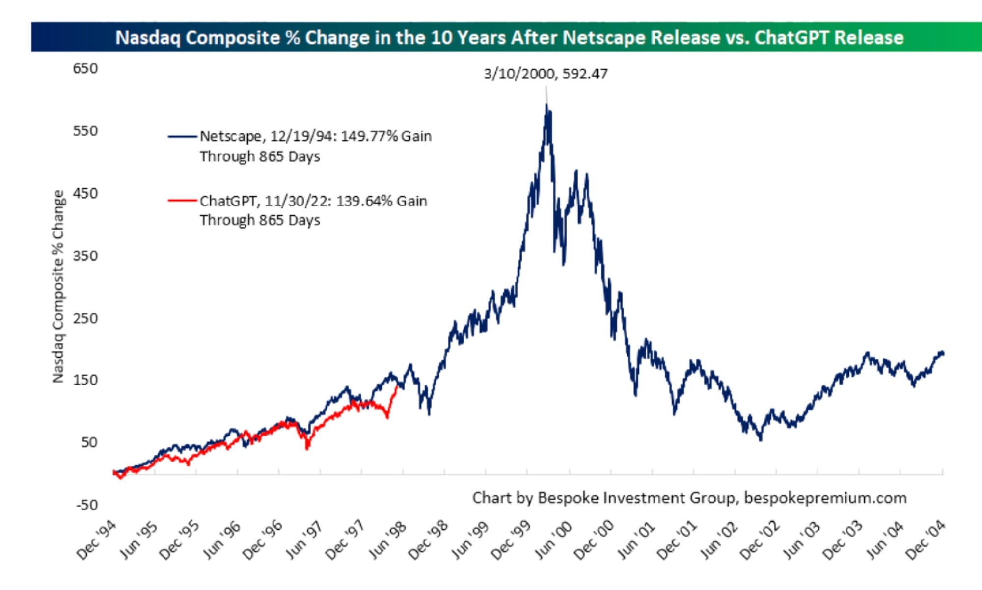
While there are (early) superficial similarities—including the madness around inference chip provider Ceberas's IPO this week—there are many important differences.
Some examples:
- Most of the upcoming IPOs are larger with cash flows, even if money-losing
- The beneficiaries seem to be much more concentrated than in the last wave, which will further increase the concentration of the major indices
- Companies are more capex-intensive, which will drive more cyclicality than in the prior wave
- Sovereign wealth funds have played a huge role, having played virtually none in the last wave